Case Study – Selligent Engagement Sphere

Background
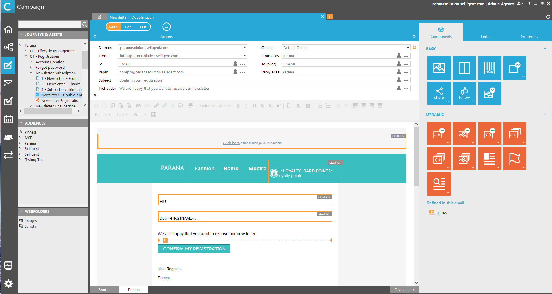
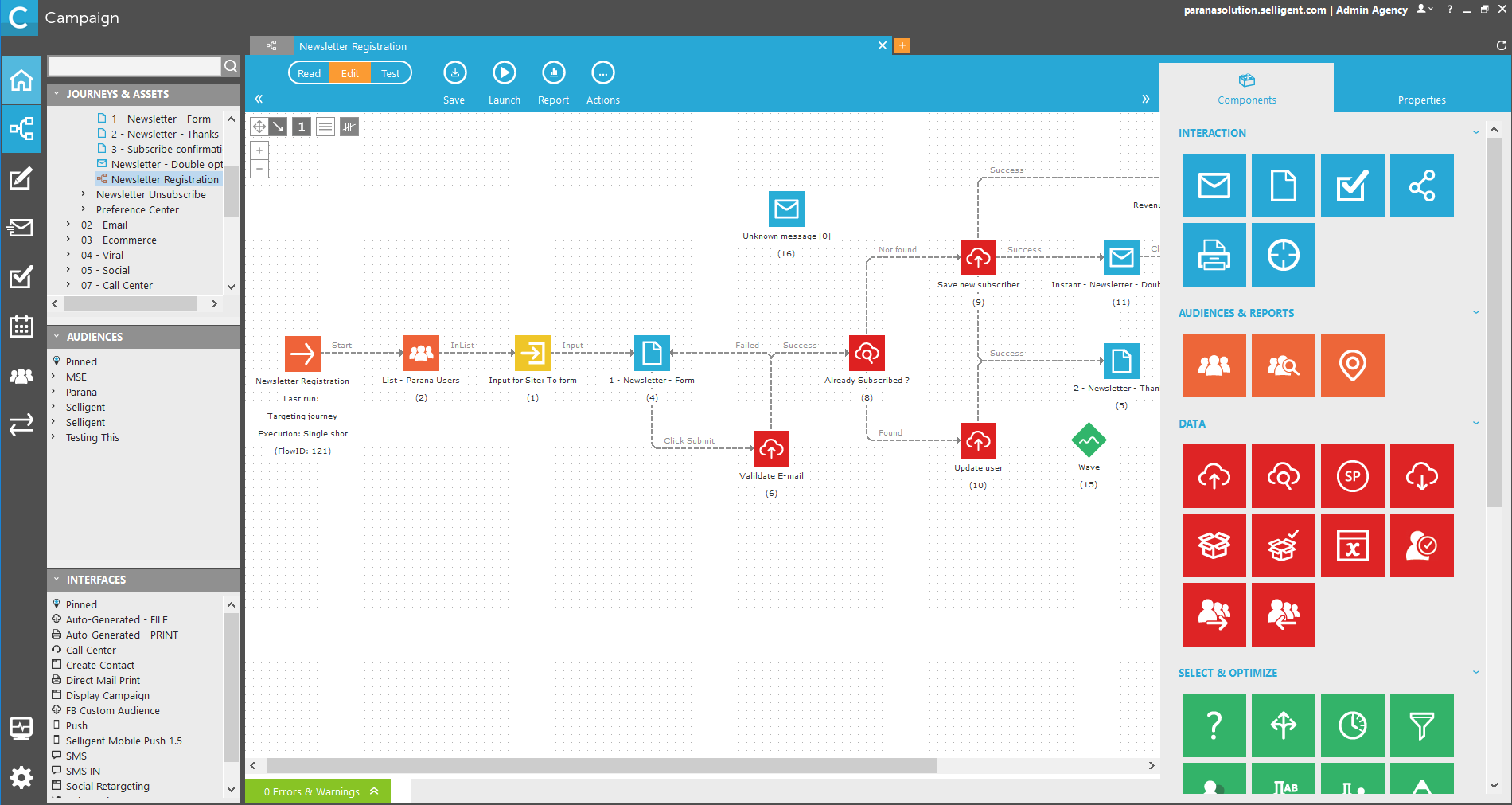
Selligent software allows marketers to engage with customers across multiple channels on a single platform, using user data to drive insights, personalization and automated campaigns.
When Selligent entered the U.S. market, users were excited about the powerful capabilities and breadth of features, however, the software didn’t meet U.S. users’ expectations in terms of ease of use and user friendliness. Users found simple tasks difficult and were faced with a steep learning curve.
DESIGN TASK
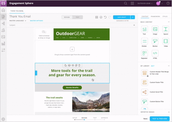
We were tasked with redesigning Selligent’s marketing automation platform, to integrate all of their modules into the new Engagement Sphere platform accessible by web browser. Further, to make it more user-friendly and to give marketers the power, speed, and control to execute their own campaigns.

Discovery & Uncover : Research Phase
The research phase included familiarization with the existing software utilizing Selligent’s online learning tools, a heuristic evaluation of the current software, benchmarking comparable products, stakeholder interviews and customer interviews.
Stakeholder Interviews
6 remote interviews were conducted with various roles including the SVP Product & Engineering, VP Global Solutions, Support Services Manager and VP Innovation & Strategic Services
Focused on identifying project goals and defining project success

Customer Interviews
12 user interviews conducted including customers across Europe and the United States
Focused on identifying user pain points, areas for improvement, and desired features and functionality

Research Findings & Prioritization
Presenting the research findings we kicked off the Clarity Lab in Belgium, where stakeholders were able to prioritize the findings and shape the scope of work. User pain-points predominately were focused in the following categories:
- User Experience Related
- Self-sufficient / Guidance
- Efficiency & Speed of Use
- Channel Related
Collaborating with the team and stakeholders during the Clarity Lab we were able to identify and prioritize the most important areas for the redesign based on user identified needs and stakeholder priorities. This helped in alignment of stakeholders and getting the development team onboard as well.
Ideating & Concepting
With priorities identified sketching began for key areas of the redesign.

Sketches were used to quickly convey ideas to stakeholders and to help in determining which direction to move forward with. Based on the selected concepts user stories were created to further refine the concept and to ensure a user-centered approach.
Information Architecture, Wireframes & Prototyping

The main focus areas prioritized for the redesign were overall navigation, the journey builder, the dashboard and the email builder. We worked closely with the client to ensure the information architecture was user friendly and aligned with their future business goals. Wireframes were completed for each area collaborating frequently with the client, developers, and visual designers to ensure a shared vision and realistic development schedule.
Prototype Demo
An Axure prototype was created with a mix of wireframes and visual comps and tested with thirteen users, nine current Selligent customers and four new users based in the states. User testing was overwhelmingly positive, current users were excited with the updates and rated the overall redesigned experience as very positive and easy to use. New users also had similar ratings marking it as a positive experience and easy to use as well. Based on the feedback from user testing we were able to make a few refinements and give Selligent the tools they needed to finish preparing for their entry into the North American market.
